Saturday, January 11, 2014

GLOW STICK ATTACK!

   This project's theme was to make some thing questionable and 3D. I wanted to make a bowl out of coils of paper because nobody really does that anymore; but I then added the idea to make it sort of a lap. I didn't want to have a boring candle or light in it though. I needed to come up with an original idea that was also questionable; so I came up with the idea to use a lot of glow sticks. To make sure that the glow sticks would shine through the bowl, I made sure the coils had spaces in the middle so that I could either stick the glow sticks through or just put them inside to shine through. When creating this project, I used a balloon as the shape for the bowl. Once the coils were made, I used a mixture of regular glue and water to dip them in so that they would harden and be easier to work with once I started gluing them together. Hot glue didn't work because it would've melted the balloon, so I used a stronger glue that would dry clear. Gluing them together was easy because I just had to make sure they fit together right. There were many different sizes of coils for this reason. Once all the coils were glued together and onto the balloon, I popped the balloon because I didn't want to keep the balloon on the inside. It was fairly easy removing the balloon off the bowl because it wasn't stuck to it in many places. We took many different pictures with the glow sticks because we want to be able to place the glow sticks in different positions. Once the glow sticks were in the bowl, it made the bowl look very mysterious. So in the end the bowl itself turn out great and the glow sticks made it even better. 


3D


John Travolta Comes To Life!

    The theme for this project was making a portrait of someone out of nontraditional materials. My group, Katie and Lindsay, decided to do John Travolta because we all liked the movie Grease he was in. We were originally going to use CD covers because of music; but even with all of our covers combined we didn't have enough to complete our project. Mr. Sands then found a box of CDs that he was ever going to use again, so he gave them to us. We started out by painting the CDs different shades of white, black, and gray because not all the CDs were the same color. The plan was all laid out about how many different shades we needed and how many of each we needed. This was difficult to complete because Katie had to count each individual pixel on the blown up photoshopped picture of John. Putting the CDs on the wall was fairly easy because we just had to follow the picture row by row. Some of our classmates came up with us sometimes to help us paint touch up on the CDs on the wall or just rip tape for us so that things would go faster. The different shades of the white, black, and grays help people see the different features on his face such as his sideburns and his cheek bones. The CDs also made the whole face come together once you were far enough back. If you stood too close, it just looked like a bunch of CDs on a wall. My choices did effect how the project turned out because I was the one who decided to paint the CDs so that everything would actually come together. It all worked out in the end though. 


John Travolta in progress (continued)


John Travolta in progress (continued)


John Travolta in progress


The Final Sticky Situation

        This projects theme was "A Sticky Situation". Mr. Sands told us that we could either do an actual 'sticky situation' or come up with something physically stick. I was originally going to do bees and honey, but I didn't like how the bees had turned out. I kept the idea of food and came up the idea to do gummy bears. Everybody else was doing food as well, but they were mostly doing foods such as syrup and bubble gum. I wanted to do a candy but also have the ability to make my painting colorful. Gummy bears come in all different colors and they were easy to draw. I was able to incorporate repetition and pattern into my painting by repeating the gummy bears all over the canvas. I also made sure that all the gummy bears were the same size so that there was some kind of pattern going on. Choosing that type of paint to use was fairly easy because I needed to be able to blend the colors together. The paint that let me do that was acrylic because water color is very hard to blend together. When I first started my project, I was only doing one bear at a time because I thought that was the better way to go. But I soon figured out that I should paint all of the same color bears at the same time because it was difficult to recreate the same color for the next bear. I ended up have 3 different colored bears in my painting as a result of this problem. In the end, the painting turned out good because I quickly learned from my mistakes.  

A Sticky Situation In Progress


Tuesday, October 1, 2013

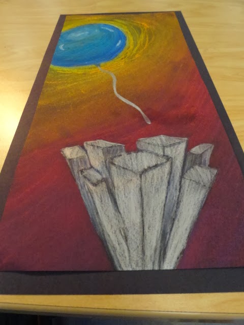
Up Close and Personal! Finished Piece

          The theme for this project was 'Up close and Personal'. There were many ways to stretch this topic. Some people took it literal and made a personal piece, but others chose to use the 'Up' of part of the theme. I chose to use the 'Up' and use a balloon floating above a city. We also had to make our main object stand out more than the things around it. I chose to make the balloon bigger than everything else and I made it look like it was floating away from the city below it. I used oil pastels for the balloon so that I could do more layering than anything else. But I used chalk pastel for the background so that I could use my finger to blend the colors together because I wanted it to look more like a sunset. For the buildings, I used color pencil for the silver to make it bright, but I used chalk pastel for the shadows so that I could blend it better.
         I took two risks with this project. The first one was with the 3D buildings. This was a risk because I didn't know if they were actually turn out like I wanted them to. I ended up cutting some of them off because they didn't look right at the bottom. The second risk I took was with the background. I originally planned to have the background completely black, but it looked really plan with just black. So I decided to make it look like the sun was behind the balloon and make everything else look like the sun was setting. I made it go from yellow to a red - purple. The purple at the bottom of the picture was to symbolize the buildings casting a shadow over the objects on the ground.
          

Monday, September 9, 2013

Whats the Point? Finished Piece

https://dl.dropboxusercontent.com/sh/lf5xim2kjpdltv9/UeVE9MO3Y-/DSC03014.JPG?token_hash=AAEWcs-KsN_TxhOvpyUvxjcrXpqrh8p52idCcNQUdKnjWQ 

      In this project, the theme was 'Whats the Point?'. We had to come up with some solutions that had to do with this theme. Some of my themes were a needle, the point of a pen, an anchor and a crystal. I picked the anchor because while I was doing my thumbnail, I thought it was the easiest one to shade and have a lot of contrast. I showed contrast by shading the anchor in different places to show that there was a light source. Another thing I did was that I left the rope completely white so that it would show up better on the dark anchor. The last thing I did was color the background completely black so that everything else would stand out. 
    While shading the anchor, I used charcoal pieces and charcoal pencils. I chose these mediums because they were the easiest to shade and blend with. I also chose charcoal because I had already used the other mediums before and I wanted to use something that I hadn't used before. 
     I used some techniques that I've never used before while I was shading in the anchor. I took a paper towel and used it to blend in the charcoal better so that there were cleaner blends. It made the anchor look like it actually had real shadows. I really liked this 'What's the Point?' project because we had to make some contrast to make the object stand out more. This way you would be able to look at that object right when you saw the picture. All and all I think this project turned out very well.

Whats the Point? In progress

https://dl.dropboxusercontent.com/sh/lf5xim2kjpdltv9/M-jBn359lB/DSC02972.JPG?token_hash=AAEWcs-KsN_TxhOvpyUvxjcrXpqrh8p52idCcNQUdKnjWQ   https://dl.dropboxusercontent.com/sh/lf5xim2kjpdltv9/Ku7ppEgz7C/DSC02989.JPG?token_hash=AAEWcs-KsN_TxhOvpyUvxjcrXpqrh8p52idCcNQUdKnjWQ

Wednesday, January 2, 2013


          While doing the drawing of the monopoly game board I had to think about many things such as perspective, the vanishing points, value and the horizon line. My completed drawing was successful because I included shadows with my color pencils. I also had to blend in the color pencils because it made it look more realistic. But before I even started using color pencil, I had to do washes of watercolor over my drawing. After I did this, I overlapped the watercolor with color pencil. The only thing that didn't work with this project was the orange in the background. I should've gradually make the orange light. If I could do my project over again, this is what I would change. I learned that you need to plan very well before you even start watercolors or color pencils.  The most difficult part of the project was adding in the highlights on the game board.

Friday, December 7, 2012

 
1. Explain how you changed your photo in the lab to create a stencil. While we were in the lab, we had to pick out our picture for our stencil and use photoshop to make the picture black and white. When we were making it black and white, we had to make sure that it was the perfect contrast with positive and negative space. Also we had to have the perfect threshold. The threshold is when there is the perfect amount of black and white in the picture. 2. When creating the collage background explain your choices of colors, materials (magazine paper, books pages, etc), and placement. How does it relate to your topic? If no relation discuss general idea. When we had our picture picked out, we went back to the room and we had to make a collage of different pictures. The pictures in background of my collage kind of went with my picture. But the general idea was to make the overall composition have a lot of color. 3. Discuss the way positive and negative space was used to create your stencil. When I was creating my stencil, I had to make sure that there was enough positive and negative space. This means that in the end I needed to have the same amount of things cut out as the things that weren't. 4. When using the xacto knife, explain the safety procedures, how to use the knife and any challenges you had to overcome while cutting. When using the xacto knife, we had to cut away from our hands and we had to make sure that our hands were out of the way so that we wouldn't cut yourself. When cutting, we had to push down kind of hard so that it cut all the way through the poster board. Some of the challenges I had to overcome were when I had to cut the boarder. This is because you had to cut straight because it was the border. 5. How was your experience with the spray paint? Discuss how color choice is important, placement of stencil, and any other concepts you noticed while creating this. When I was using spray paint is was really fun . Choosing the colors that you would use was kind of hard because you wanted it to look good and once you spray it on there, there is no going back. The placement of the stencil was very important because you had to keep it still while you were spraying so that it wouldn't smear.
 
                               
1. Describe the process you went through to change your object into the correct perspective to create the drawing. This is when you were in the lab. While we were in the lab, we had to choose our picture for our colored pencil anamorphosis drawing and insert it into photoshop. When were in photo shop, we had to transform the picture so that it was in the right perspective. After we had our picture picked out, we had to draw a grid on both the picture and in our sketch book. I had to draw the cup to scale and I had to give it value when I was coloring it. The last thing we did was give it a shadow so that it looked like it was standing up.
2. How did distorting and stretching the object allow for you to create a drawing that would look different to the viewer? While distorting and stretching out the picture, it help it look like it wasn't just sitting on the paper. It helped the viewer see that it was actually standing up. But you did have to look at it at a certain angle so that it looked right. Otherwise it would just look extremely stretched out.
3. What were the most important concepts in the project to make it successful? The most important concepts of the project to make it successful were to make sure that the picture was stretched out enough so that it looked right. Also I think that the shadow made a big difference because it gave the impression that it was a 3D object and not 2D.

Monday, October 29, 2012


SELF EVALUATION


1.     Describe the overall composition of your artwork (balance, unity, rhythm and movement).
      I think my balance was good because the picture turned out ok. The rhythm and unity was good too. But I do think that my lines could have been a little straighter. Also My print didn't have much detail in the background, so I could of added a little more then what I have.
2.     How did you add texture and contrast to your print? Is this important? Why?
      I added texture and contrast to my picture by putting spots on the cheetah and making the trees to make them look like they had leaves. This is important because it helps the print look more realistic.   
3.     Explain how you used positive and negative space to show your image.
       I used positive and negative space in my image. I showed it by having and equal amount of cut out area and non - cut out area. This helped make the spots on the cheetah stand out more.
4.     Describe the craftsmanship of your print. (How good the project is technically crafted)
       I think the craftsmanship of the print was good. I think this because the lines were cleanly cut. Also because the actual printing was neat. The final products were done very well because there were no smudges on the paper after the paint.
5.     Were you able to achieve depth by showing a foreground, middle ground and back- ground? Explain.
      Yes, because I made the grass bigger at the bottom and smaller at the top. This made the grass seem bigger closer up. It also made the smaller grass seem farther away. I also made the tree in the background smaller because I wanted it to look like it was closer to the cheetah then the other grass.
6.     Explain your experience with Printmaking. What were the obstacles and advantages?
      My overall experience with print making was ok. This is because it was kind of hard to figure out what to cut. Some advantages would be that we didn't have make five different stamps.

Thursday, October 4, 2012

Print Sketch Critique

1. Why is texture so important to have in your sketches?
   The texture is very important in the sketch. This is because when you do your stamp you need to have a lot of texture to make it look good. You need to because there is only a limited amount of space for you to draw your animal. If you have a lot of texture then you can have positive and negative space in your stamp.

2. Why is it neccessary for you to have several references of each animal and each background? Explain.
  It is necessary to have several references for both the background and the animal. It is very important because you want to have many view points that you can look at. Also if there is something is one picture that you like and something in another that you also like, you might want to combine them. An example would be saying that you like one tree in one picture and the grass in another. This is why it is very important that you have many references.

3. When you look at your sketches are you able to see which sketch is the strongest and will make the best print? How do you know this? 
  I am able to look at each of my sketches and see which one would be best for the print. I know this because I have to chose the one with the best texture on it. I also had to pick the with a good background in it as well. I also know that this one was the best one because my other sketches didn't have has much detail as this one.


Chalk Mural Critique 
                                                                                                                                      
1. Explain your experience working on a team and executing your ideas for the mural.
    I liked working on a team because we were doing such a big project that I would've needed help anyways. I also like this group because we all came to an agreement when we were deciding what to draw on the wall. I think we should work in groups more often because we get done faster and we are bringing all our talents together. So in the end I really like working in a group.
2. Explain the importance of collaboration when working on a team.
   Collaboration is very important because we all need to communicate on our ideas. If we don't, then our work will never get done. So if you don't communication, then the whole project will never get done. Also if we don't like each, we would still have to work together to get everything done.
3.  How successful was this project? Explain how and why.
   I think this project was very successful. I think this because our angel wings turned out very well. We got the wings the same size and the have many different colors in them that go really well. Also our background turned out very good because the blues, purples, and blacks go together really well. We also learned how to blend in the colors with a paint brush. This technique worked really well.
4. Explain how you feel about creating artwork that others can interact with. Ex. Involving the whole school? 
   I love having the whole school being able to look and interact with my art. I like this because my art is usually just in the classroom. But when we do it outside then everybody can see it. Also everybody can interact with it.