
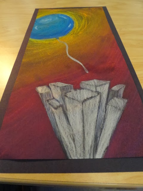
The theme for this project was 'Up close and Personal'. There were many ways to stretch this topic. Some people took it literal and made a personal piece, but others chose to use the 'Up' of part of the theme. I chose to use the 'Up' and use a balloon floating above a city. We also had to make our main object stand out more than the things around it. I chose to make the balloon bigger than everything else and I made it look like it was floating away from the city below it. I used oil pastels for the balloon so that I could do more layering than anything else. But I used chalk pastel for the background so that I could use my finger to blend the colors together because I wanted it to look more like a sunset. For the buildings, I used color pencil for the silver to make it bright, but I used chalk pastel for the shadows so that I could blend it better.
I took two risks with this project. The first one was with the 3D buildings. This was a risk because I didn't know if they were actually turn out like I wanted them to. I ended up cutting some of them off because they didn't look right at the bottom. The second risk I took was with the background. I originally planned to have the background completely black, but it looked really plan with just black. So I decided to make it look like the sun was behind the balloon and make everything else look like the sun was setting. I made it go from yellow to a red - purple. The purple at the bottom of the picture was to symbolize the buildings casting a shadow over the objects on the ground.